Project Name Here 1
2023
2 Weeks
How I Improved Google Play Store UX as a Product Designer
As a Product Designer at Google, I undertook the task of enhancing the user experience (UX) of the Google Play Store. My approach focused on improving usability, visual design, and overall user satisfaction. The following summarizes the key steps and strategies I employed:
User Research
I initiated the process by conducting comprehensive user research. This involved surveys, interviews, and user behavior analysis to understand pain points and user needs. By identifying common issues such as difficulty in finding apps, confusing navigation, and slow loading times, I gained valuable insights into where improvements were needed.
Information Architecture and Navigation:
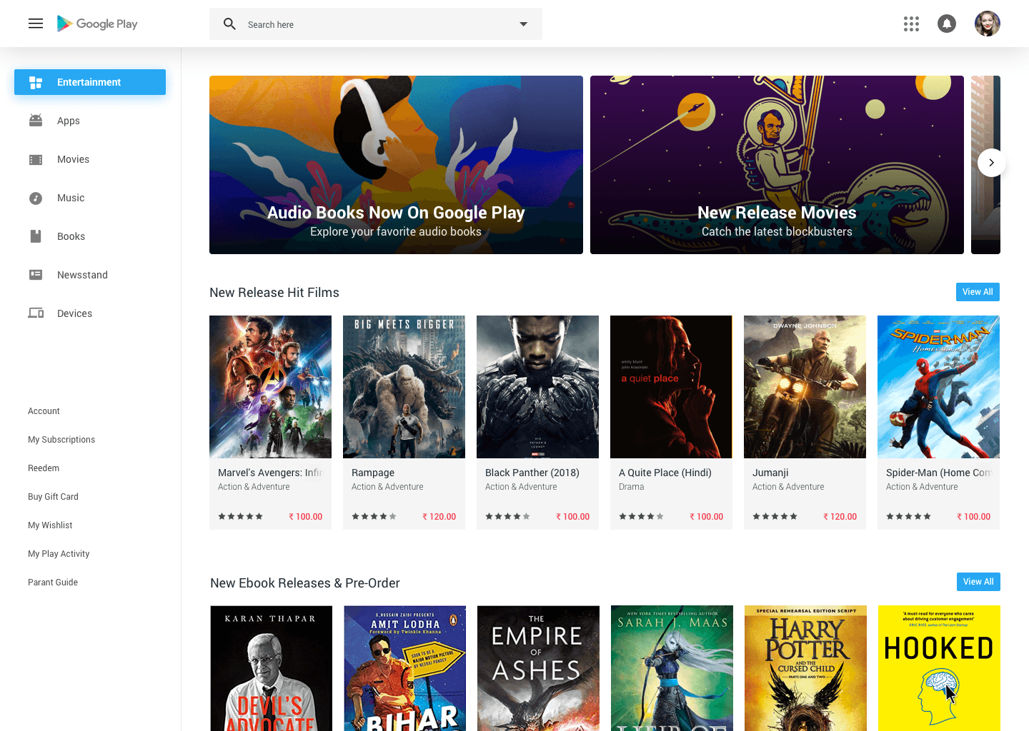
I restructured the information architecture of the Play Store to make app discovery easier. I streamlined the navigation by categorizing apps more intuitively, implementing a clearer hierarchy of sections, and ensuring that the most relevant and popular apps were prominently featured.
Visual Design:
I revamped the visual design of the Play Store to align with Google's Material Design guidelines while adding a unique touch to enhance the platform's identity. The design changes included optimizing color schemes, typography, and visual elements for a more visually appealing and cohesive experience.
Personalization and Recommendations:
To enhance user engagement, I introduced a more robust personalized recommendation system. By leveraging machine learning and user behavior patterns, I ensured that users were presented with app suggestions that matched their interests and preferences, encouraging them to explore and discover new apps.
Performance Optimization:
Recognizing the importance of speed in user satisfaction, I collaborated with the engineering team to optimize the Play Store's performance. This involved minimizing loading times, optimizing images, and implementing efficient caching mechanisms, resulting in a smoother and more responsive user experience.
Clearer App Information:
I restructured the app information pages to present key information more clearly. This included placing important details like app ratings, user reviews, and screenshots prominently. Additionally, I improved the readability of app descriptions, ensuring users could make informed decisions about installing apps.
User Feedback Integration:
I integrated user feedback mechanisms within the Play Store interface to allow users to provide input easily. This direct feedback loop helped identify ongoing issues and gather insights for further improvements.
Accessibility Considerations:
Inclusivity was a priority. I ensured that the Play Store adhered to accessibility standards, making it usable for individuals with disabilities. This involved implementing features such as text-to-speech for app descriptions and ensuring proper color contrast for improved readability.
Results:
Through these efforts, I successfully enhanced the Google Play Store's UX, leading to tangible improvements in user engagement, app discovery, and overall satisfaction. User feedback indicated increased ease of use, quicker app searches, and a more enjoyable browsing experience.
My work on improving the Google Play Store's UX exemplifies my dedication to user-centered design principles and my ability to bridge the gap between aesthetics and functionality. By leveraging research, design principles, and collaboration, I delivered a more user-friendly and visually appealing platform that continues to resonate positively with users.


